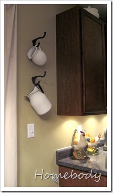
Nevertheless, I did get something done yesterday, with the help of my 6’2” husband. What would I do if I were a single woman? I guess I’d just have to stock up on stepladders and learn to wield the tools by myself, instead of just saying “honey, can you reach that for me?”.
This photo caught my eye in a recent Pottery Barn catalog, specifically the pitchers hanging on hooks.
{Photo removed at the request of Williams-Sonoma, Inc.}
I had some pitchers, and I found hooks at Hobby Lobby. They were 50% off, so I got 2 for $2.99.

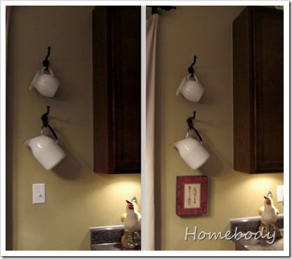
Now there are three little issues with this arrangement: 1) bad night time photos…sorry, 2) the pitchers hang at different angles so it looks kind of off…I’ll just keep looking for a more matching set, and 3) the light switch. I’d like your opinion on the light switch.
It turns on the outside light for what would be our deck. Since we don’t have a deck, and won’t for years, we never use it. I used to have it covered up with some art that have hollow backs (the switch is behind the spoons).

I think it’s kind of distracting and dumb-looking with the pitchers. I could still cover it up with one of the pictures, or I could just leave it. Or I could think about moving the hooks/pitchers, but this really is the best place for it; anywhere else in the kitchen and people could bump their heads on it.
What do you think?


12 comments:
I would paint it the same color as the wall. It wouldn't stand out so much and no need to clutter with art.8>)
What a great idea! Love the pitchers.
Paint the switch! You can change the "switch" to a flat cover with no switch, that'll help it to blend in. We had a telephone jack in a very random place, we covered it with a patch thingy (sorry to be so technical!) and painted right over that, instead of using a cover. That's another option, maybe, since you won't be needing the light soon. Of course, consult an electrician first!
Best,
Emily from Nap Time Is My Time
I love the pitchers....ideas for ya - I like the switch covered...maybe something a little lighter to flow with the white pitchers and it sill go even more together....and you can just put something inside of the pitcher to make it weigh down and make the angle the same. Love the little display!
I would take the switch out for now, use one of those 'blanks" to cover the hole in the wall, and paint it with the wall color. That way it would be useable in the future, but somewhat camo'd. The pitchers looks great - don't fret about how they hang differently; they would since they are different themselves. Looks cute. (:
Those pitchers are adorable, I love themw ayt they look.
Love the pitchers. Paint the switch cover to match your wall.
I think it looks fine with the two pitchers without the artwork.
Unfortunately, light switches, phone jacks, cable plugs, are those things of modern life we have to live with, and I don't think they are a distraction to your pitchers at all.
I don't like the look of painted light switches. But, how about a decorative light switch cover?
I think the switch looks fine uncovered. People need to have switches. I know it maybe doesn't make the best photo with the switch right there but if I visited your house, I wouldn't wonder why you had a switch there!!!
I really like the idea of hanging the jugs on the little hoooks. It looks really pretty. I have far too many jugs and this would be a great way to display them.
Sarahx
I love the pitchers and hook idea! Good job you! As for the switch, I don't find it that distracting. It's a light switch and it's part of functioning in a home. No big deal.
Switches are a part of life. Your's really isn't distracting.
What I was distracted by was that the hooks/pitchers weren't balanced against the length of the cabinet.My suggestion would be to move the hooks and pitchers up on the wall so they're more balanced next to the cabinet. That would move them up a little higher above the switch.
I didn't even notice the light switch. I like your hooks and pitchers!
I love the pitchers ... I think the way they hang at different angles is fine. And I didn't even notice the light switch till you commented on it ... I agree with the other commenters: paint it.
Post a Comment