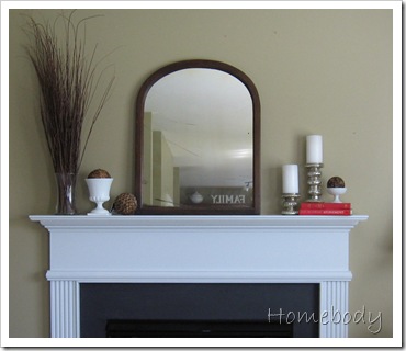
In Monday’s post about my mantel, I took you through the accessorizing process, and then in another post showed which one I chose and why.
This is the one I kept

But this is the one my commenters liked the best (well, maybe not the whole thing, but they like the branches):

Based on that consensus, I got back to work. This is what I have now:

I like it best of all! (Yes, we still have a bare lightbulb in this room. I don’t even notice it anymore, although I do intend to do something about it. Eventually.) There is a reason that the left side is visually heavier than the right side, which I explained in that second post {here}.
I plan to spray-paint the A a more true white since it looks yellow compared to all the other elements.
So, what say you now? I don’t plan on changing it again, so at least pretend you like it (jk).
{I’m linking this to Nester’s Fall Mantel party; even though I wasn’t specifically thinking fall when I did this, I think it has a rustic, earthy, understated fall feel.
If you are visiting from the party, I have several giveaways going on this week that you are welcome to enter.}


17 comments:
Love the new one. I think it looks perfect! Much better!!! The other seemed to empty and unfinished!!!
Oh I do love it!!!! How nice! Soooo....what did you end up doing with your new family picture...or did I miss that...
By the way I love the branches too!!! Missing having a mantel right now...
I do like the new one better! And, I don't know if I would even paint the "A". There is so much white the yellow color is a nice variation up there. I'm sure it will be great either way. :)
o wow I love it! very warm and fall
Hey Holly, I love it....and I'm not just saying that....Doesn't it make you feel so good to have a completely different look from time to time? I know you will be pleased..
Looks Great
Love love love!! I actually think it was really a cool idea to have your readers choose for you. :)
I love it!! It looks great :)
Your right this one is even better.
Perfection. :)
very nice, I love that mirror
vedy, vedy, NICE!! I like the branches!
Suzanne
I forgot to ask you...where did you find the letter A? I would love to find a large "P" for a wall in our living room. Thanks!!
I love it, especially the A. It looks great! Still love those branches!
I love, love, love it! Oh, and I can totally relate to the bare bulb. ;)
Looks good but...I still like the red books dor a small pop of color.
Melinda
Love it!
great mantle, beautiful blog
http://grammyababychangeseverything.blogspot.com
Post a Comment